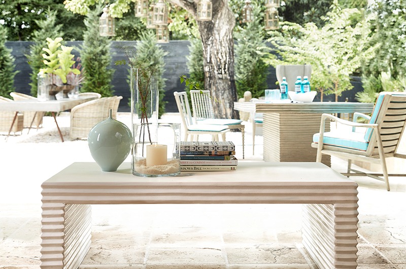
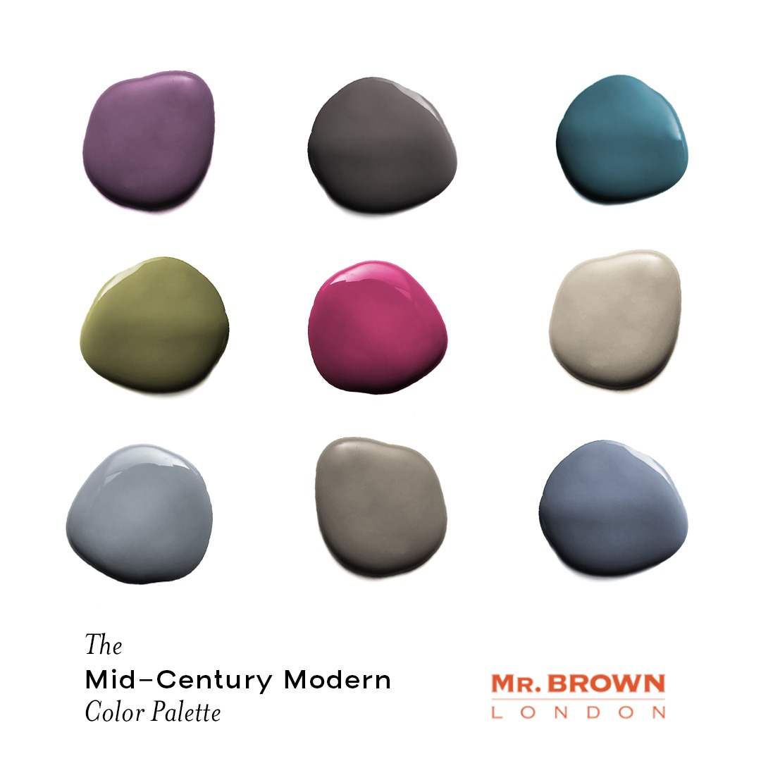
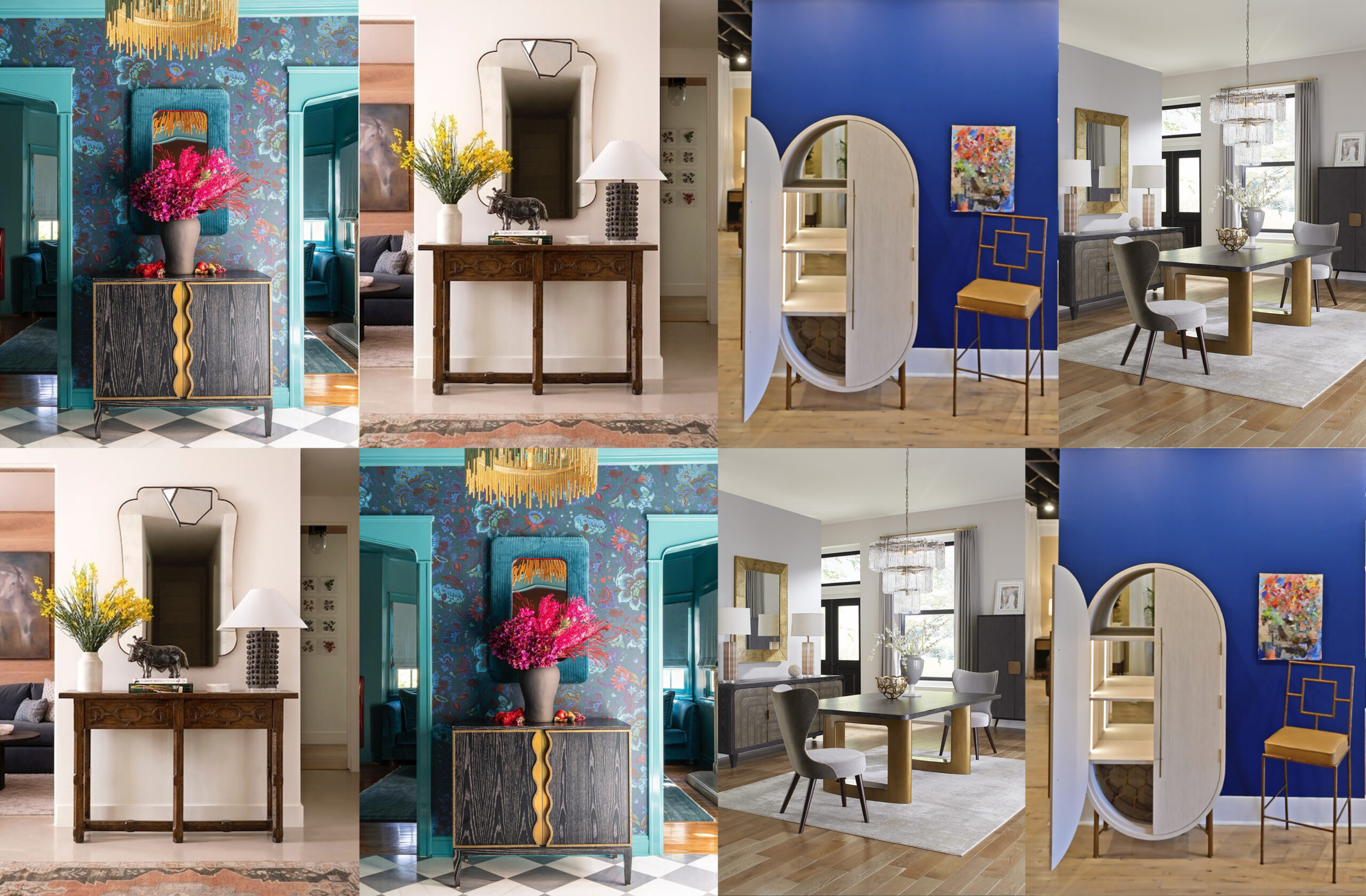
 Calming, restoring, and welcoming, the down-to-earth tones of teal and taupe complement nearly any shade in the mid-century modern color palette. Take, for example, the
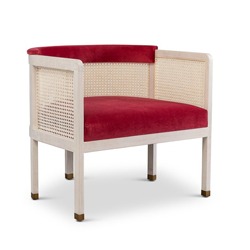
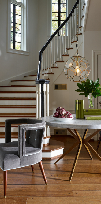
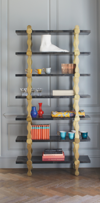
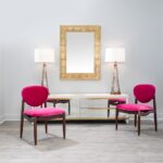
 Classic white never goes out of style. Whether it’s the peak of the mid-century modern movement or a simple homage to your favorite era, you can’t go wrong. Whites, off-whites, and cream tones look striking and make a great backdrop for a room that has an eclectic mix of textured furniture, or a space with a lot of interesting shapes that take center stage— like the
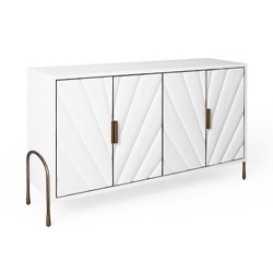
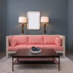
 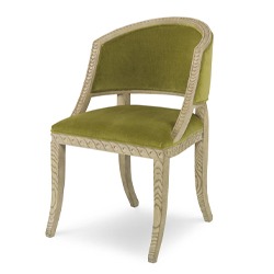 Last but certainly not least, we can’t create a mid-century modern color palette without mentioning olive greens. These rich neutrals are earthy yet exciting and look absolutely lovely as an accent wall in a dining area or kitchen. If you’re not sure what colors compliment olive, we recommend mustard yellows and neutrals like white, gray, and taupe. We’re just loving the way this looks with the
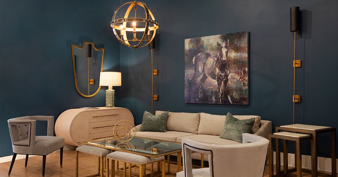
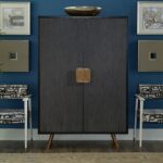
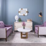
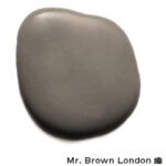 This darker gray is a popular choice for many mid-century designs simply because it goes with almost all neutral colors. From warm accent colors like amber to cool dark greys and blacks, this shade of gray goes with them all. One of our designers,
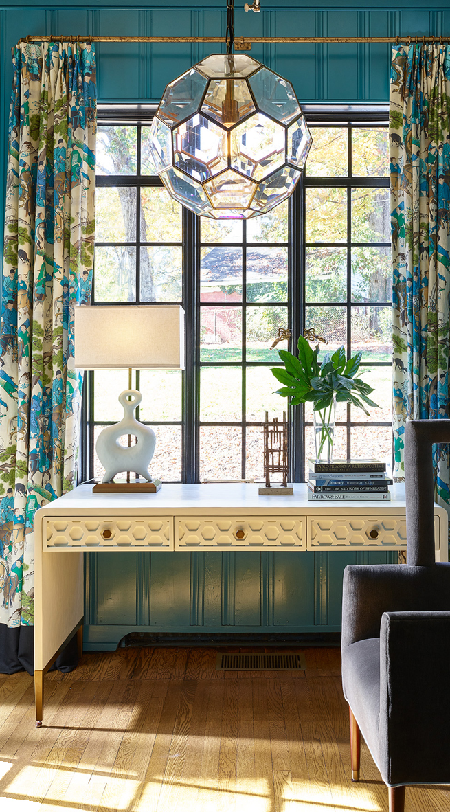
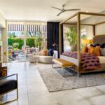
 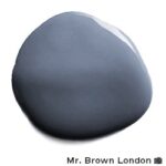 Blues are another popular choice for walls in a modern design. Whether it’s a darker blue or a lighter shade of the world’s most loved color, blue goes well with most modern designs regardless of the distinct style or the purpose of the room. We really like how well it flatters more pastel colors, particularly light blues.
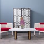
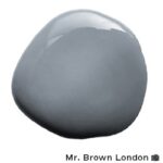 Light gray, like other colors that fall on the mid-century modern color wheel, goes well with numerous styles that can add a unique nuance to a room. For example, if the goal is to
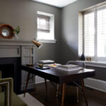
 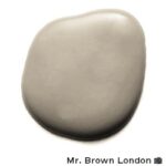 One of the best mid-century modern colors, this off-white shade is versatile enough that it works for many different styles, including one of our favorites, organic modernism. Use this color to add nature to your interior style and create a living space that is comfortable and relaxing.
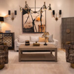
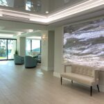
Six Creative Ways to Divide a Room in Two
The open-concept design has begun to lose its charm for many homeowners as the world has grown to accept the new normal of virtual workplaces and schools. Creating a remote workspace away from the office has become vital to mental health. The same can be said for any room in the home. The division of living rooms […]
Read More