If you’ve ever walked into a room and your mood immediately changed, there’s a good chance it had to do with the color of the space. An important component of interior design is knowing how to leverage color to evoke a specific tone, feeling, and mood. For example, choosing a vibrant yellow wall color for the bedroom might not inspire the most peaceful or calm feeling—but, to each their own.
So, what is color anyway? According to The Art Career Project, color is the way the eyes and brain perceive different wavelengths of light reflected off of objects. In theory, it seems pretty simple, but there’s a lot more that goes into the psychology of color. Whether you’re thinking of painting a new space or refreshing something old, be sure to carefully consider your color choices for a totally revamped atmosphere—after all, the role of color in interior design can’t be understated.
The Psychology of Color
According to Wikipedia, color psychology is “the study of different hues as a determinant of human behavior. Color influences perceptions that are not obvious, such as the taste of food. Colors have qualities that can cause certain emotions in people.”
For example, warm colors like red, orange, and yellow can be considered stimulants while cool tones like blue, purple, and green are more calming. Here is a sampling of colors and what they typically evoke or represent:
Red
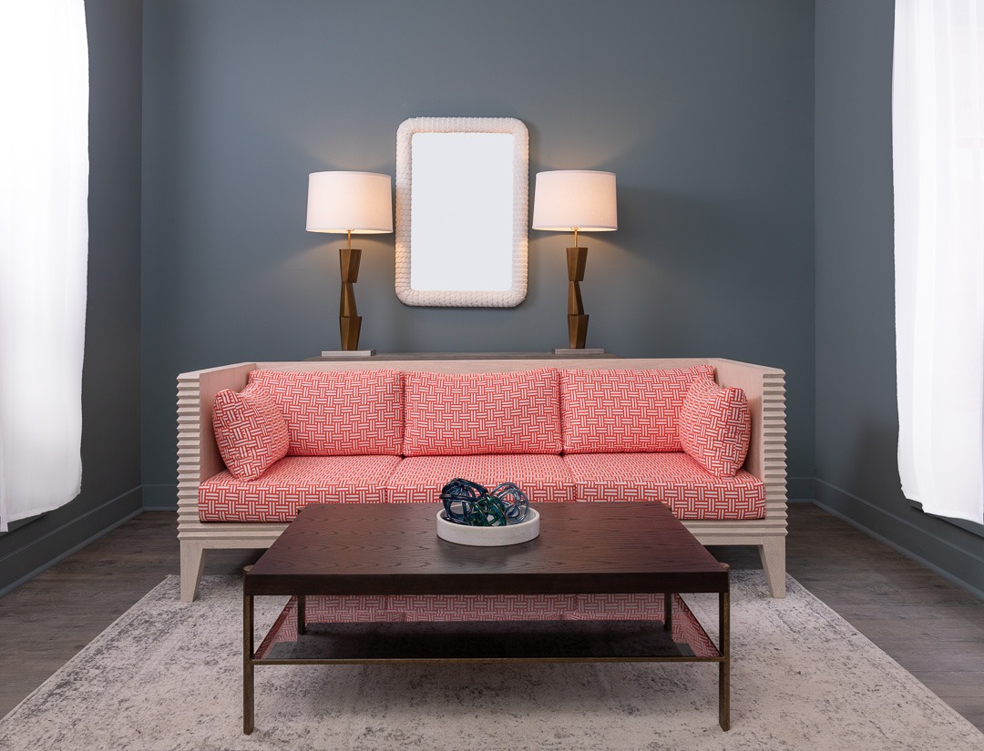
As a general rule of thumb, red represents feelings of energy, strength, power, and passion when used in an interior space. It can also be used as an eye-catching accent color, especially for kitchens. In fact, red is known to increase the appetite.
Orange
This color in interior design is often associated with joy, enthusiasm, happiness, creativity, and success. Like red, orange can stimulate the appetite, so it may be a good option for a kitchen or dining room—plus, it’s a beloved color among mid-century modern designers.
Yellow
Along the same lines as other warm colors, yellow typically represents joy, happiness, intellect, and energy. It works well in kitchens, dining rooms, bathrooms, and entryways. As a tip, this color can be very polarizing, so it’s important to choose the right shade.
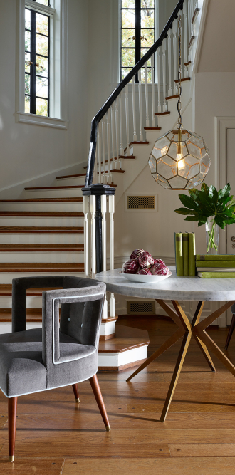
Green
This is considered one of the most calming and pleasing colors to the eye. It represents calmness, security, growth, and harmony. Green is a color in interior design that can be easily used anywhere in a home or space because of its versatility and popularity.
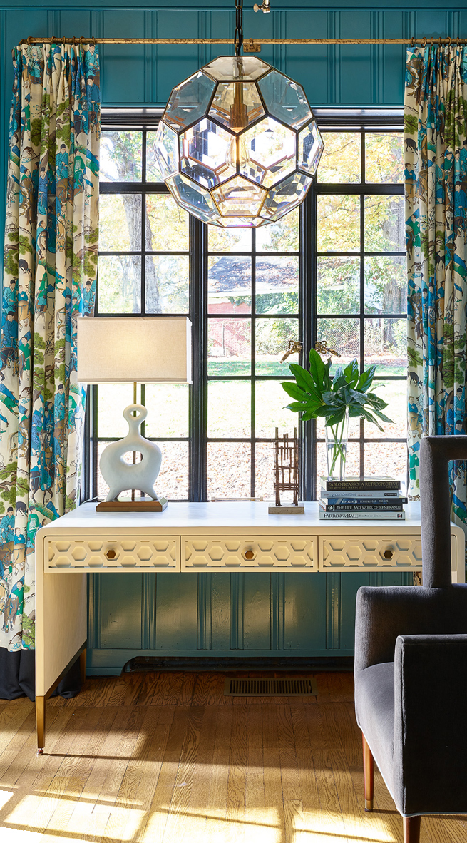
Blue
As one of the most popular colors for homeowners and designers, blue is associated with trust, loyalty, wisdom, faith, and calmness. On a more scientific level, it can slow down the metabolism and calm the mind and body—it’s even been able to help reduce blood pressure and slow the heart rate. Blue is a great color for a bedroom, office space, or living room to create a cozy atmosphere.
Choosing the Right Shade
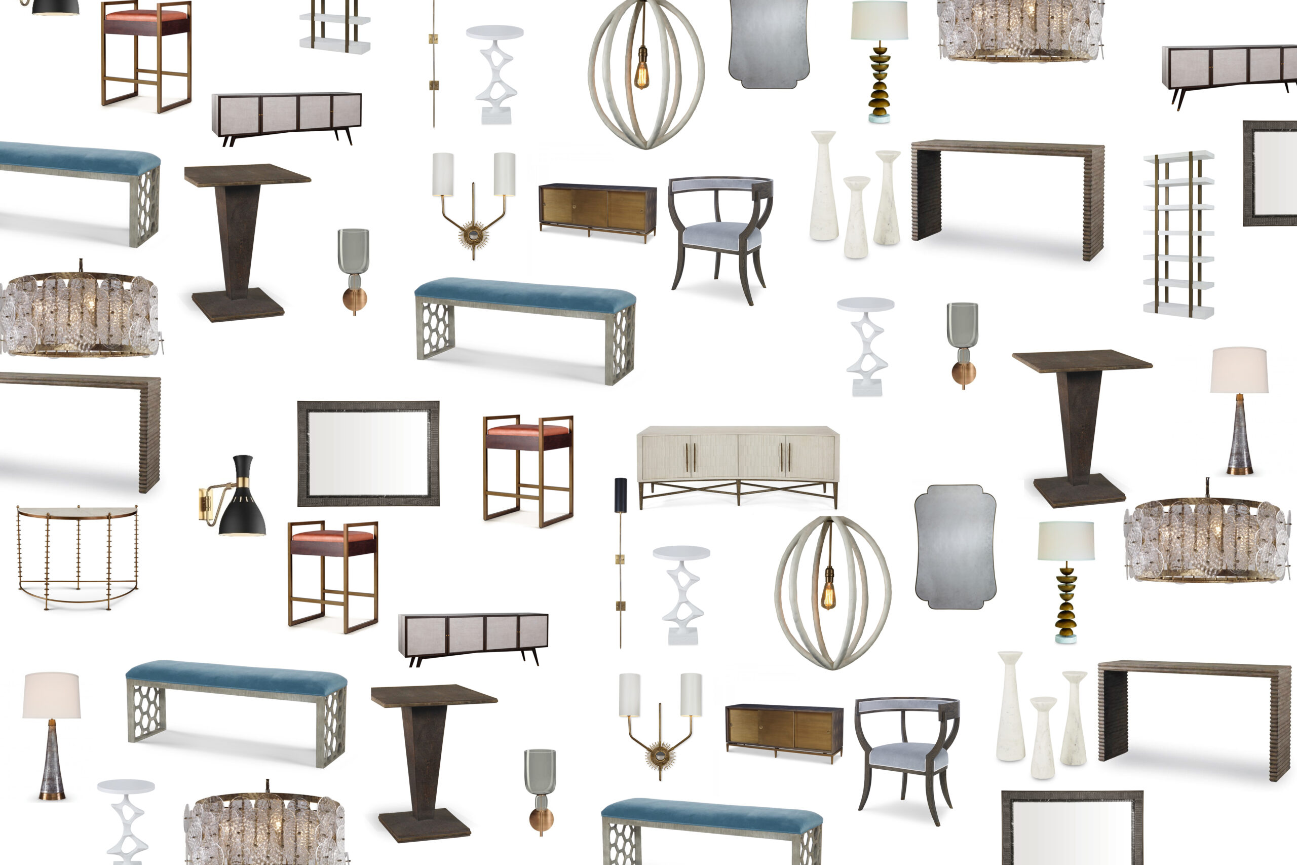
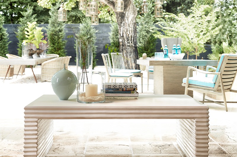
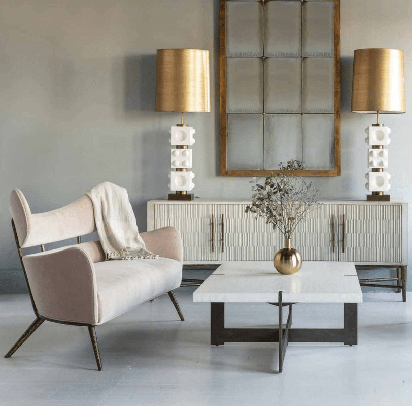
Once you have chosen the right color, it’s paramount that you consider the right shade, too. According to My Decorative, a specific shade can easily over-stimulate or under-stimulate a space. For example, lighter tones can make a room feel more refreshing and inviting, while darker, richer tones can make a space feel more intimate. If you’re thinking of creating a mid-century modern room, read our blog for more inspiration on a color palette, complete with furniture and shade recommendations.
Overall, color and interior design go hand-in-hand—each rely on each other to curate a space from top to bottom. Both professional designers and passionate DIY-ers must understand the impact that color can have in a room and choose a scheme accordingly. If you’re interested in learning how to design with the colors of the year, read our blog for styling tips. Or, explore the world of textured furniture to uncover unique ways to add intrigue to any room.